Optimizing static SVG
There seems to be four ways of using SVG:
- SVG as html image <img src=”image.svg” />.
I rarely use this method as it creates a new http request, I might as well use a jpg or png unless to save a bit of space if the SVG file is a lot smaller. - SVG as a background pattern image or divider.
I like these styles from tympanus and used some of them: https://tympanus.net/Development/SectionSeparators/
(website here) - SVG as inline code
The one I use the most, as I’m not calling a new http request and the file is much smaller than the jpg/png/gif formats.
I’ll mainly be concentrating on refining SVG as inline code as its the one I use most.
Browser support for static SVG
When I worked in smaller companies, we didn’t worry too much if it didn’t work in IE, but it’s a different story working in banks.
Mainly I use: http://caniuse.com/#search=svg to check compatibility, and unfortunately it doesn’t work in:
- IE8 — good news though, we just dropped support for IE8 two months ago.
- Mobile Android 2.3 — we don’t need to support, our minimum is Android 4.0.3
Also its hard to test IE when you work on a mac, so I find it useful to be friends with the tester in the scrum team :)
Software to create SVG
I’ve been using illustrator when i started using SVG maybe back in 2013 before sketch came out. But now I design in Sketch and they have a SVG export functionality. It’s a bit of a pain switching programs so I tried using Sketch to export SVG.
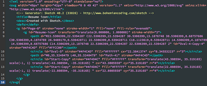
But I was shocked, the code was so junky and translating the shapes to rotate rather than drawing out the points. Bizarre. I re-drawed the same pictogram in illustrator and the code was much cleaner with actual points of the shape paths. The difference with the below pictogram:


My illustrator workflow
Deciding on the size of the SVG
- If its animation I find it easier to make it by 100px by 100px so the points would be cleaner rather than many decimal points.
- If its an icon, we go by 8px. So 24px, 32px, 40px etc. I find if I draw it by 100px x 100px when it shrinks down it doesn’t look as I wanted to. So I prefer to draw it by 1x or 4x the actual size. Like if the icon is for 24px, I draw it by 96px.
- If its a pictogram that is a specific size for a project, like 64px, then I just draw it at 64px.
Drawing the SVG
I try to draw it so its like a flat tangram, with no overlapping layers. For example I cut all the paths out in the overlapping areas:

I save two illustrator files, one working and one when i’m ready to create as an SVG.
Exporting the SVG file
- File > save as SVG I get the following code
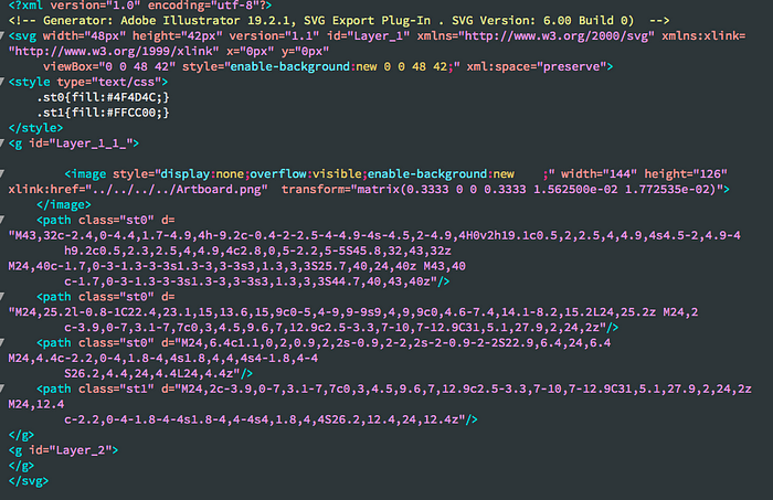
- File > export — the code is much cleaner it strips off a lot of junk code
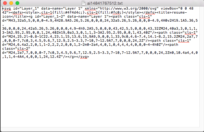
It cleans up the junk code such as Generator code, Doc type, xml version,:

Exporting the file as SVG is the way to go.
Optimizing the SVG
There are some SVG compressors out there:
- SVGO — But I need help setting it up, I need node.js and terminal
- http://petercollingridge.appspot.com/svg-optimiser
- https://jakearchibald.github.io/svgomg/
I use this one, I find it easy to use.
And the compressed code from the exported SVG from illustrator:

Seeing if it works
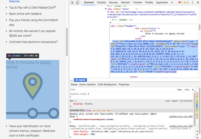
So after I compressed the SVG I go onto our website and inspect editor and paste that chunk of code onto the site. This is to see if the SVG works in our framework and also when the SVG compresses, it rounds up the paths to the decimal point.
Hopefully it shows up and looks crisp and clean — I play around with the width and height and blow it up really big and small. If all looks good, I send it off to the developer to implement.
And for android, the developers can implement it as android:pathData

SVG as icons
I mainly use svgs in my project used once as icons are still handling by icomoon as we still needed to support IE8 til 2-3 months ago.
Now that we dropped support for IE8, we can move away from icon fonts, but SVGs as sprites or symbols using icomoon, grunt/grunticon is still new for me.
There are also the same issues — do we make the icons hug together with no spacing? But they might have different widths or the all same standard box size with redundant padding around some of the icons (which leads to slight misalignment to margins/paddings in the design).
Probably too big a post for this one.
Notes about Viewport and ViewBox
Viewport and viewBox was doing my head in, and I’ve been changing the width and height rather than touching it. But I thought I should try to understand it:
- Viewport — the height and width of an element, the visible area of the SVG
- ViewBox — determines co-ordinate system and aspect ratio — x, y, width, height. e.g. viewBox=”0 0 100 100"
If I create an svg that is 100px x 100px and wanted it that size then perfect, then I don’t need to change anything:
<svg width=”100" height=”100" viewBox=”0,0,100,100">….</svg>
If i want to double the size, it will scale up perfectly:
<svg width=”200" height=”200" viewBox=”0,0,100,100">….</svg>
But if the values don’t scale up perfectly then i leave the viewBox and add the code preserveAspectRatio:
<svg width=”300" height=”75" viewBox=”0,0,100,100">….</svg>
preserveAspectRatio: (align) and (meet or slice)
I find this really useful from chriscoyier:
Accessibility
From this site: https://www.sitepoint.com/tips-accessible-svg/
The recommended accessibility code for an SVG is (in bold):
<svg version=”1.1" width=”300" height=”200" aria-labelledby=”title desc”>
<title id=”title”>Green rectangle</title>
<desc id=”desc”>A light green rectangle with rounded corners and a dark green border.</desc>
<a xlink:href=”http://example.com">
<rect width=”75" height=”50" rx=”20" ry=”20" fill=”#90ee90" stroke=”#228b22" stroke-fill=”1" />
<text x=”35" y=”30" font-size=”1em” text-anchor=”middle” fill=”#000000">Website</text>
</a>
</svg>
I was talking to our accessability guy and showed him the article above. Do we need to include the aria-labelledby, title, desc, a to know its clickable and text.
His response:
“For simple icons/buttons etc. the aria-labelledby/<title> approach is a bit more robust than just using an aria-label; the only other thing to do would be add role=”img” to the opening <svg> tag for iOS/VoiceOver.
I’d say for this type of SVG it would be pretty rare to need an additional description — possibly for a custom widget that needs a ‘hint’ to explain how to interact with it.
To manage focus, I think just nesting the <svg> in the most appropriate element (<button>, <a> etc.) as suggested in the article is the best approach — then the SVG can handle the image and text while the button or link handles the interaction.”
So something like this for accessibility would be fine, adding in role=img and deleting the <a> link and text:
<a href=”#”>
<svg version=”1.1" width=”300" height=”200" aria-labelledby=”title desc” role=”img”>
<title id=”title”>Green rectangle</title>
<rect width=”75" height=”50" rx=”20" ry=”20" fill=”#90ee90" stroke=”#228b22" stroke-fill=”1" />
</svg>
</a>
